A breakthrough for on-the-move satellite communications
Test 1
01. Test 1
Test 2
02. Test 2
Test 3
03. Test 3
Earlier in this tutorial we made a web page with rows and columns, and it was responsive, but it did not look good on a small screen. Media queries can help with that. We can add a breakpoint where certain parts of the design will behave differently on each side of the breakpoint.
Earlier in this tutorial we made a web page with rows and columns, and it was responsive, but it did not look good on a small screen. Media queries can help with that. We can add a breakpoint where certain parts of the design will behave differently on each side of the breakpoint.
Earlier in this tutorial we made a web page with rows and columns, and it was responsive, but it did not look good on a small screen. Media queries can help with that. We can add a breakpoint where certain parts of the design will behave differently on each side of the breakpoint.
Trusted by the world's leading satellite technology companies
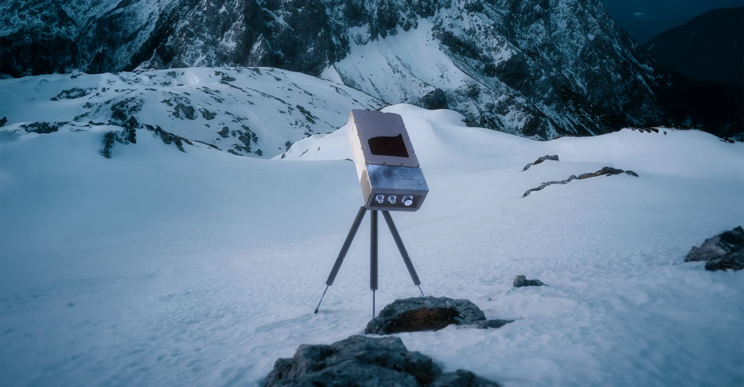
“The SWISSto12 product brings two innovations to meet our business needs. The small size addresses a gap in our fleet strategy, enabling us to be increasingly more targeted to meet specific customer requirements.”
Jean-Luc Froeliger
SVP Space Systems
What to expect
No more than 30 minutes
Discussion about our products and your requirements


